case_03:
duration:
client:
role:
Lehoczky Dental
1.5 months
uni project; Lehoczky Dental
UX/UI Design; research
intro
For this project, our team was tasked with designing and developing a website for Lehoczky Dental, a dental clinic in Hungary looking to attract Danish patients through dental tourism. The goal was to create a website that would inform and convince Danish users to travel to Hungary for affordable, high-quality dental care.
The project was part of my 3rd-semester Multimedia Design program, where we applied Design Thinking as our development method. The challenge was to address the concerns of Danish users, such as cost, trust, and the logistics of traveling abroad for dental care.
problem statement
In Denmark, dental care is expensive and not covered by the free healthcare system. Many Danes avoid regular dental check-ups due to high costs, leading to untreated dental issues. Hungary, on the other hand, is a popular destination for dental tourism, offering the same quality of care at a fraction of the price.
However, Danish users are hesitant to travel abroad for dental care due to concerns about cost, quality, and the logistics of planning a trip. Our challenge was to design a website that would address these concerns and make dental tourism in Hungary an attractive option for Danish users.
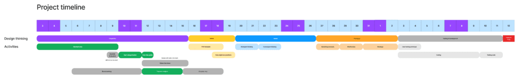
process overview
We followed the Design Thinking framework, which included:
Empathize: Researching user needs and pain points.
Define: Reframing the problem into actionable insights.
Ideate: Brainstorming solutions and features.
Prototype: Designing wireframes and high-fidelity prototypes.
Test: Conducting user testing to refine the design.
research & empathize
We started by gathering standard data about dental health in Denmark and dental tourism in Hungary. We found that 40% of Danish adults skip regular dental check-ups due to cost, and Hungary is one of the top 3 cheapest countries for dental procedures.
To better understand our users, we conducted qualitative interviews with 4 Danish participants. These interviews revealed that users were frustrated with the high cost of dental care in Denmark and worried about the complexity of planning a trip abroad for dental treatment. They also valued professionalism, clear communication, and modern equipment in a dental clinic.
Using these insights, we created empathy maps to visualize what users say, think, feel, and do. This helped us identify key pain points, such as distrust in foreign clinics and the fear of hidden complications when traveling for treatment.
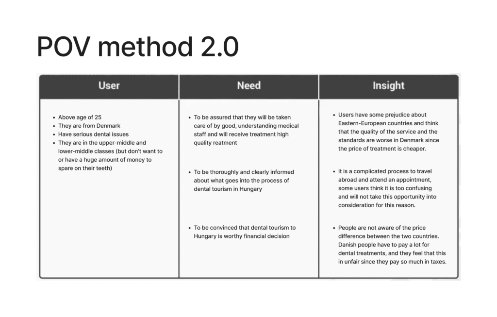
define
With a clear understanding of our users’ needs, we used the Point of View (POV) method to reframe our findings into actionable insights. We identified three main user needs:
- Assurance of quality: Users needed to feel confident in the clinic’s expertise and professionalism.
- Clear information: Users wanted a straightforward explanation of the dental tourism process.
- Financial transparency: Users needed to see clear evidence that dental tourism was a financially smart decision.
We then turned these needs into “How Might We” questions, such as:
- How might we assure users about the qualifications of the medical staff?
- How might we make the logistics of dental tourism easy to understand?
- How might we highlight the financial benefits of dental tourism?
ideate
In the ideation phase, we brainstormed solutions to address the user needs. One of our key ideas was to create a step-by-step guide that would walk users through the process of dental tourism, from booking a consultation to traveling to Hungary. We also wanted to highlight the clinic’s 20+ years of experience and showcase patient testimonials to build trust.
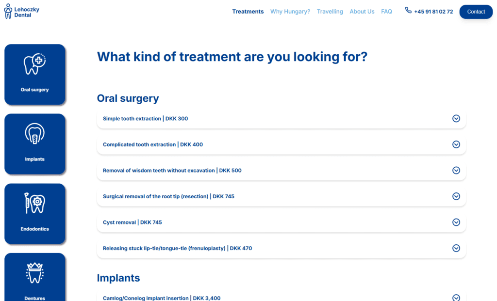
Another important feature was a price comparison tool that would clearly show the cost difference between dental care in Denmark and Hungary. We also considered adding a virtual tour of the clinic to give users a sense of the facility’s professionalism and modern equipment.
development
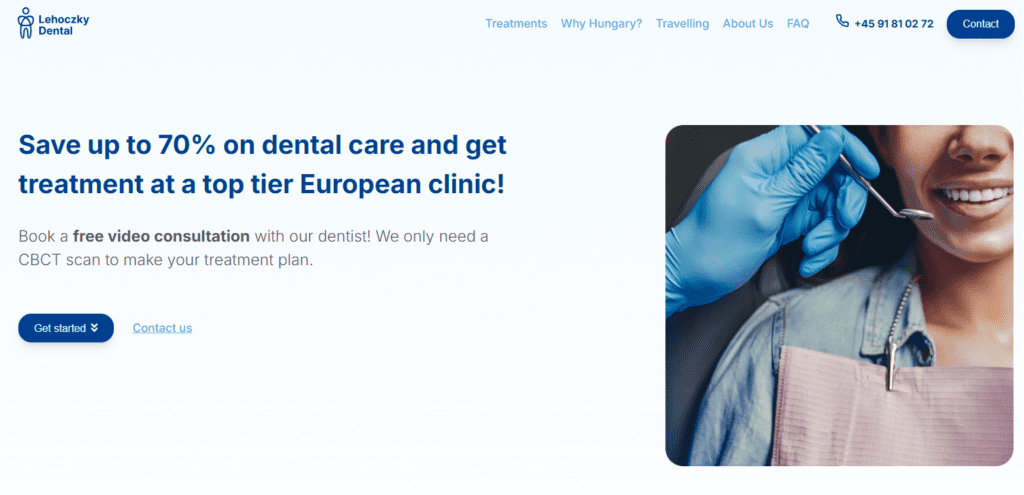
We skipped low-fidelity sketches and moved straight to wireframing and high-fidelity prototypes in Figma. For the landing page, we used the Four Cs framework (Clarity, Context, Creative, Call-to-Action) to create a clear and compelling hero section. The headline, “Save up to 70% on dental care and get treatment at a top-tier European clinic,” immediately communicated the value proposition, while the supporting text provided context and reassurance.
We also incorporated design patterns like carousels, accordions, and sub-navigation to reduce cognitive load and make the site easy to navigate. For example, we used a carousel to showcase patient testimonials and an accordion to organize FAQs.
During development, we used SASS to write clean, modular CSS and ensure consistency across the site. We also made the site fully responsive, optimizing it for all screen sizes using a 12-column grid system.
testing
We conducted two types of user testing to refine our design:
5-second test: Users were shown the landing page for 5 seconds and asked about their first impressions. The results showed that users understood the site’s purpose and found it professional and trustworthy.
Think-aloud test: Users were asked to complete tasks like finding the price of a consultation and sending a question to the clinic. This revealed a few usability issues, such as the need to highlight free consultations earlier on the page.
Based on the feedback, we made several improvements, such as adding more prominent calls-to-action and ensuring that contact information was interactive (e.g., clicking an email address would open a draft email).
conclusion
This project was a great opportunity to apply Design Thinking in a real-world context. By focusing on user needs and iterating based on feedback, we were able to create a website that not only looks professional but also addresses the concerns of Danish users considering dental tourism.
If I were to revisit this project, I’d explore more advanced features, such as an interactive price calculator or a virtual tour of the clinic, to further enhance the user experience.